The primary function of a magic book, of course, is to teach magic secrets. It’s the contents and clarity that are usually the focus of the reader. But sometimes, the form is interesting, too.
I think I first began paying attention to the form of the book – the layout and design of the words and pictures on the page – when I laid eyes on Jim Steinmeyer’s The Magic of Alan Wakeling. In the unorthodox layout of this book, a full three inches of whitespace lie atop of most pages between the header and the start of the text. Roughly 1/3 of the every page is unused. What a strange and interesting design choice, I thought at the time. Now, I cherish its uniqueness of the design among a sea of Times New Roman, header-to-footer volumes.
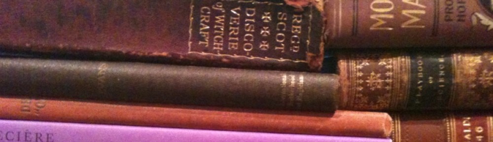
There are many others with unique looks as well. Rather than list my favorites – how about a game…With just a few inches around the page number – how many of these authors/volumes/publishers can you recognize? Scroll down for a list of titles if you need a hint. Answers at bottom. Enjoy!
The Samples
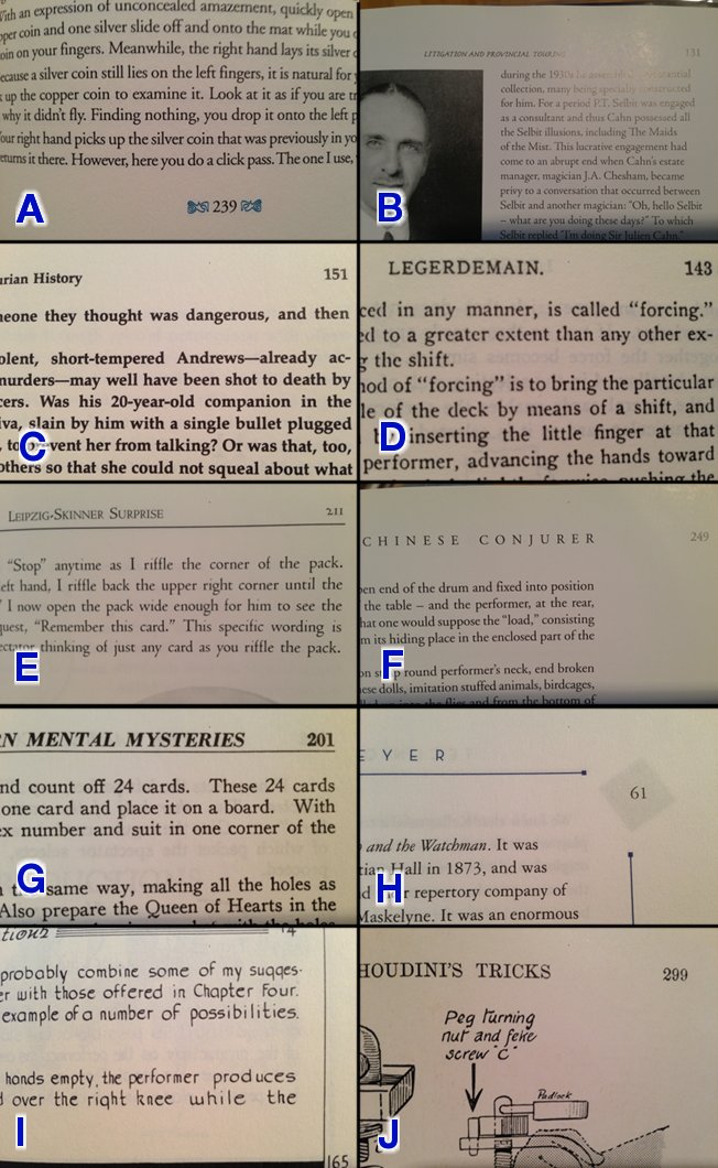
How many can you name?
Books & Authors
- Booth, John. Creative World of Conjuring. Los Alamitos : Ridgeway Press. 1990. 264 pp. Cover | Full Title
- Carney, John. The Book of Secrets: Lessons for Progressive Conjuring. NP : CarneyMagic. First edition. 2002. 367 pp. Limited, signed edition of 100 copies. Cover | Full Title
- Dawes, Edwin A. The Great Lyle. Pasadena : Mike Caveney’s Magic Words. 2005. 298 pp. Limited edition of 1,000. Cover | Full Title
- Erdnase, S. W. The Expert at the Card Table. Chicago : The Charles T. Powner Co. 1902, 1975. 205 pp. Cover | Full Title
- Goldston, Will. Will Goldston’s Exclusive Magical Secrets. London : The Magician, Ltd. [1912]. Numbered edition, with locking hasp. Cover | Full Title
- Karr, Todd, ed. The Silence of Chung Ling Soo. Seattle : The Miracle Factory. 2001. First edition. 488 pp. Cover | Full Title
- Rice, Harold R. The Encyclopedia of Silk Magic: Vol. 1. Boston : ESM Publishers. 1948, 1986. Fourth Printing. 520 pp. Cover | Full Title
- Steinmeyer, Jim. Technique & Understanding: New approaches for stage illusionists. Burbank : Hahne. 2009. 304 pp. Cover | Full Title
- Tarbell, Harlan. The Tarbell Course in Magic. Vol. V. New Jersey : D. Robbins & Co., Inc. 1927, 2005. Eighth Printing. 417 pp. Cover | Full Title
- Wonder, Tommy and Minch, Stephen. The Books of Wonder: Volume I. NP : Hermetic Press, Inc. 1996. 327 pp. Cover | Full Title
Answers
A – 10. The single color blue dingbats surrounding page numbers were the give away for this influential book.
B – 3. A tough one, for sure. Though consistently quality in subsance, the thing most inconsistent in Mike Caveney’s Magic Words publications has been their style. The fonts and layout have changed from book to book in the “Magical Pro-File” series, but never quite settled. It has improved considerably over time, but reached it’s pinnacle – in my mind at least – here with Lyle and Dawes’ excellent history.
C – 1. The Booth books. Their constant, nonsensical use of “10-point Palatino Bold” in the body text, as proudly proclaimed in the Colophon (itself, a rarity in magic texts). What to use for the headers when the text is all bolded already? Well, Garamond bold, to be sure! They design was apparently dictated by John Booth himself.
D – 4. Nothing special in the layout here. Typical of any turn-of-the-century text. However, as arguably the most studied text in magic, I thought it would be interesting to see how recognizable it was in excerpt.
E – 2. A tough one here – the oval photograph cut-off at bottom might have been the only clue. I’ve never felt this John Carney masterpiece got the distribution or reception it deserved. The number of artistic choices made in this book is staggering – from delicate font, the chapter heads, the processing of the photos to near-illustrations and their placement in-line. The book approaches perfection in teaching – and a book that can be returned to again and again as the student progresses.
F – 6. Unlike the Caveney books, Todd Karr has had the same template design for his books since the beginning of The Miracle Factory books. That includes the design of his e-books and even book tests. The design is simple, subtle, and places the focus on the contents – which generally need little assistance in shining.
G – 9. No bastion of layout here, but with eight volumes forming the core of most magicians’ education, hopefully the Tarbell course was somewhat recognizable here.
H – 8. A specific book and, with a high price tag, probably not one in wide distribution (unfortunately for Jim, but fortunately for the purchasers…) I’ll bet all those who owned it, though, instantly recognized its design. The ink of the subsequent page’s diamond logo seeps through the page forming a subtle, magical afterimage of the right-hand page numbers – a perfectly suited complement to Jim’s early theme of “reminding and deceiving.”
I – 7. Francis B. Martineau’s hand-lettered 3-volume masterpiece (not be sullied by that computerized fourth volume typographical monstrosity…) should be instantly recognizable. A genius testament to is dedication, unlikely to be equalled again in this lifetime.
J – 5. The key here was the diagram. Often of a barely-thought-through explanation of another performer’s work; one that passes muster for the minute or two you are reading, but fails miserably in practice. I am writing, of course, to the works of Will Goldston.


